The Client
Almanac Coffee is a family-owned micro-roaster in Duluth, Minnesota, rooted in community values. They roast seasonal, single-origin beans.
The Objective
Justin, a longtime client, approached me with a new espresso blend he'd been developing for retail. This was the first of what would eventually become multiple blends, so he needed not only a single label, but a system that could serve future products. It was also important to him that the label stayed true to Almanac's brand and identity, so a thoughtful naming process was the first order of business before illustration and labelwork could begin.
The Approach
I began by exploring themes related to the business name, Almanac, and the seasonality at the core of Justin's business. Many directions carried a similar thread, eclipses, moon phases, and other celestial cycles that mark time's slow, natural passage.
Sundial stood out among them, largely unclaimed territory in the coffee world. Historically, almanacs included sundial calculations, tables that helped readers adjust a sundial's reading to the correct time for the season, alongside their more familiar moon phase and tide predictions. Both mark the passage of time in a way that feels grounded and unhurried.
Once we landed on the name, art research began. We looked at old stamps, antique tin packaging, sundial diagrams, vintage posters, and sun motifs across decorative traditions, searching for the right visual language. Along the way, we came across sundial mottoes, short inscriptions traditionally carved onto sundials, often written in Latin and ranging from lighthearted to somber, reflecting on time or the day at hand. Justin's packaging already had a history of featuring literary and famous quotes, so the mottoes were a natural fit, a way to carry that same tradition forward while tying directly into the sundial concept itself. That's when we knew, with certainty, we had the right direction.
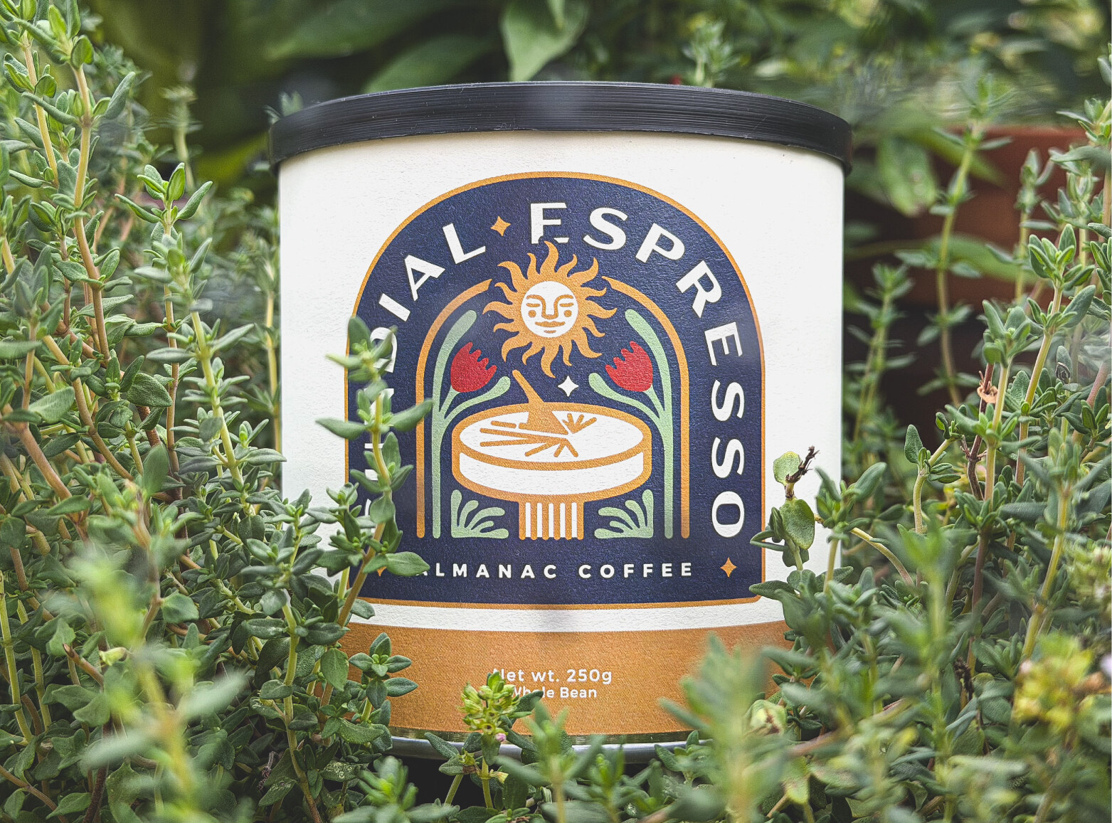
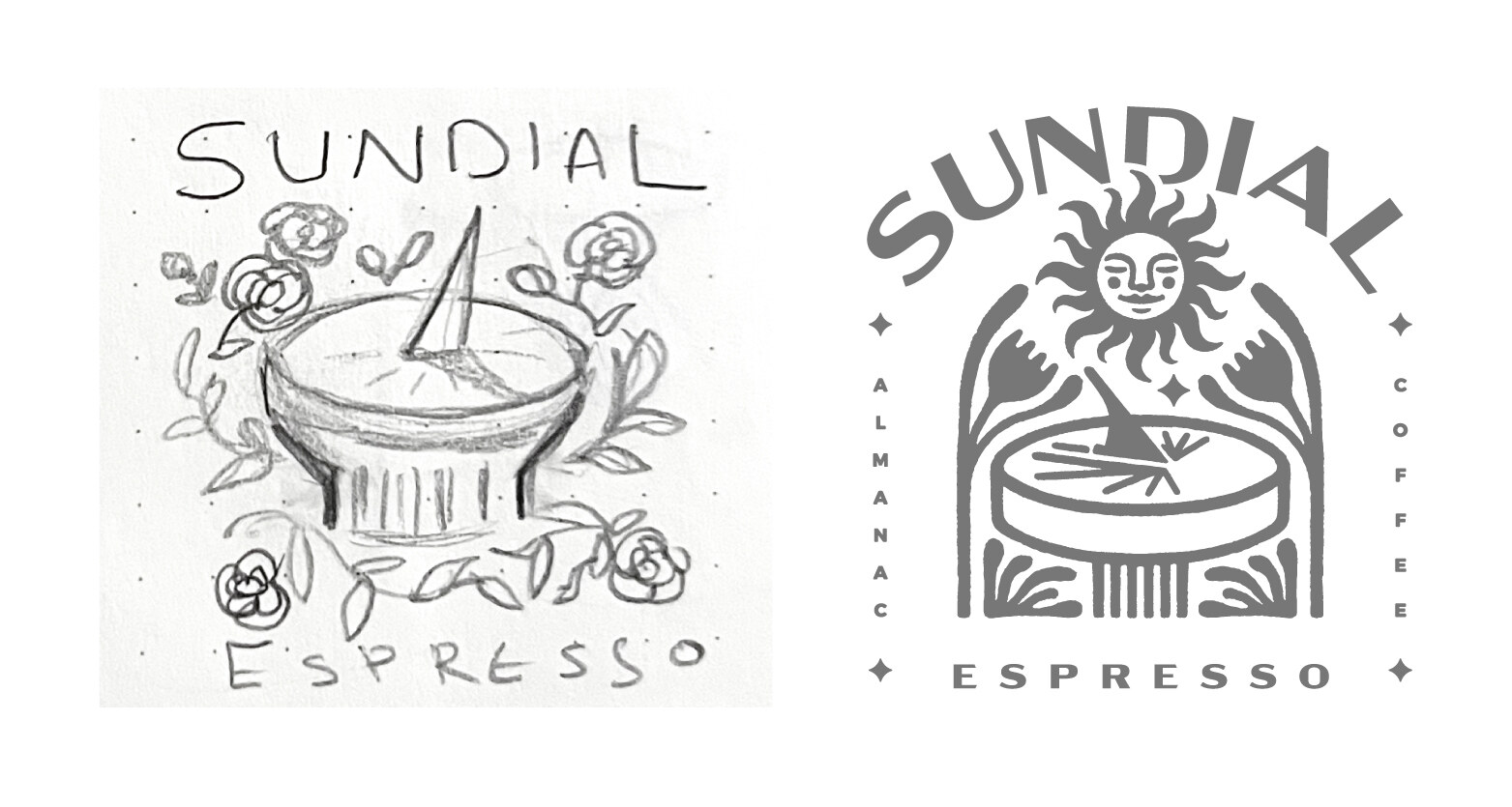
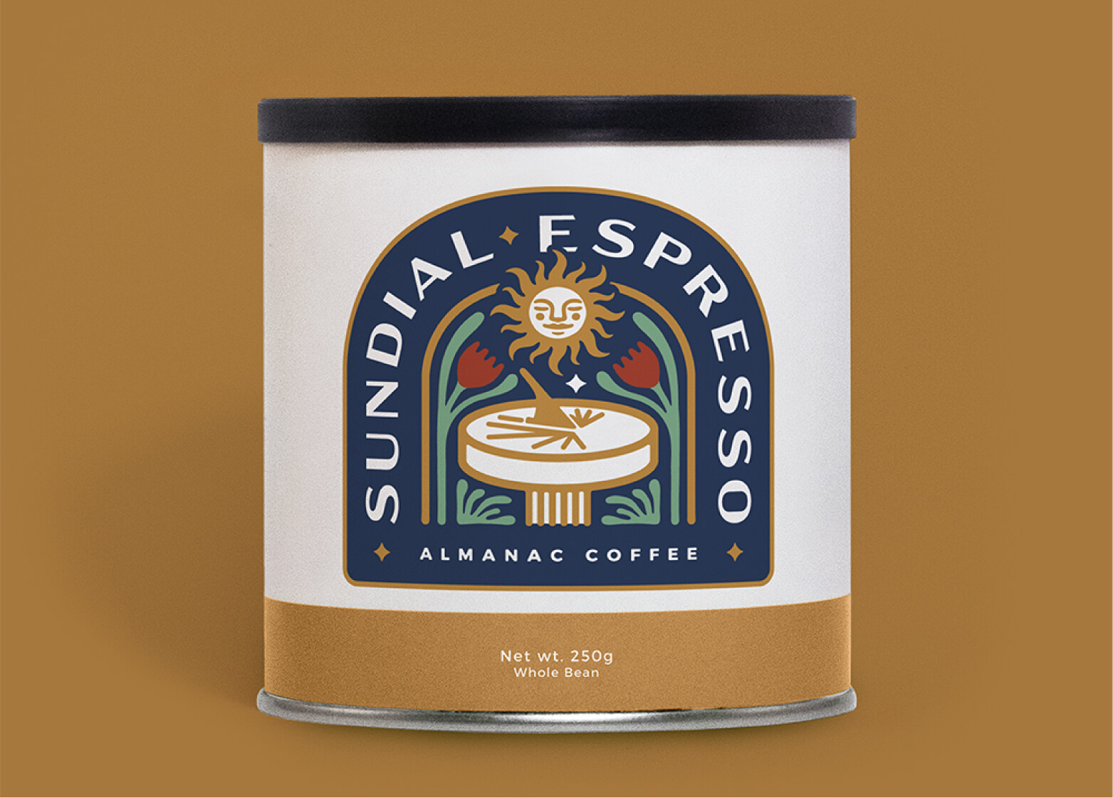
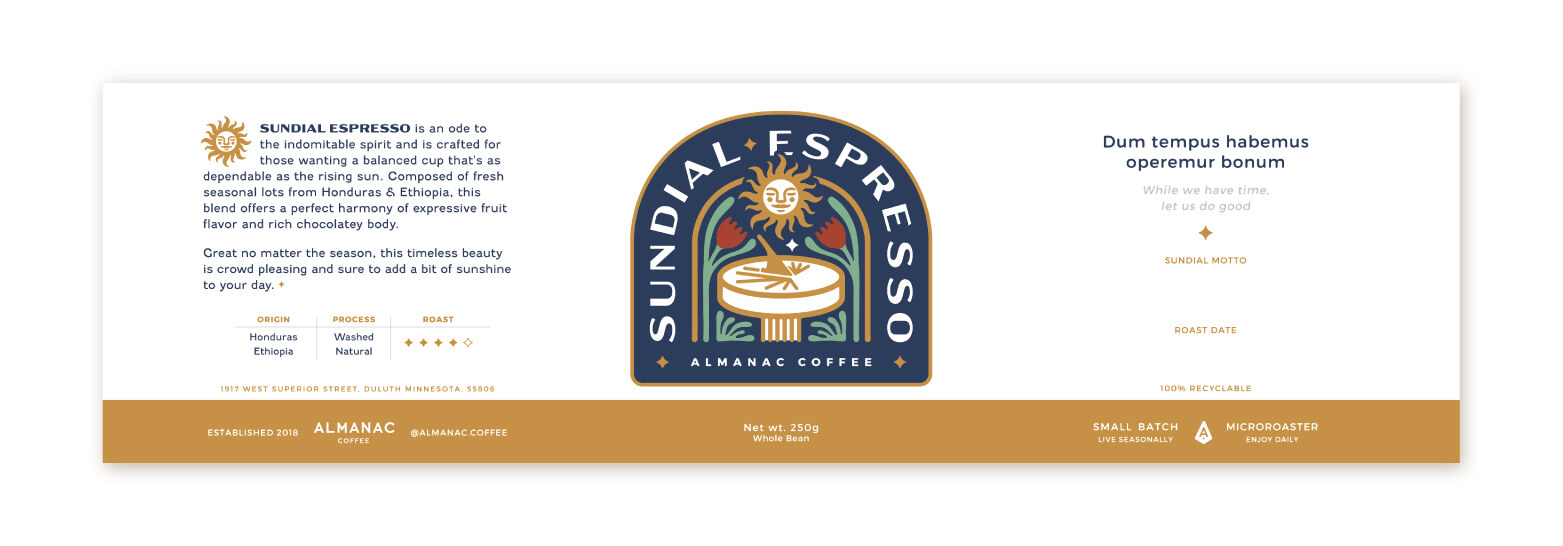
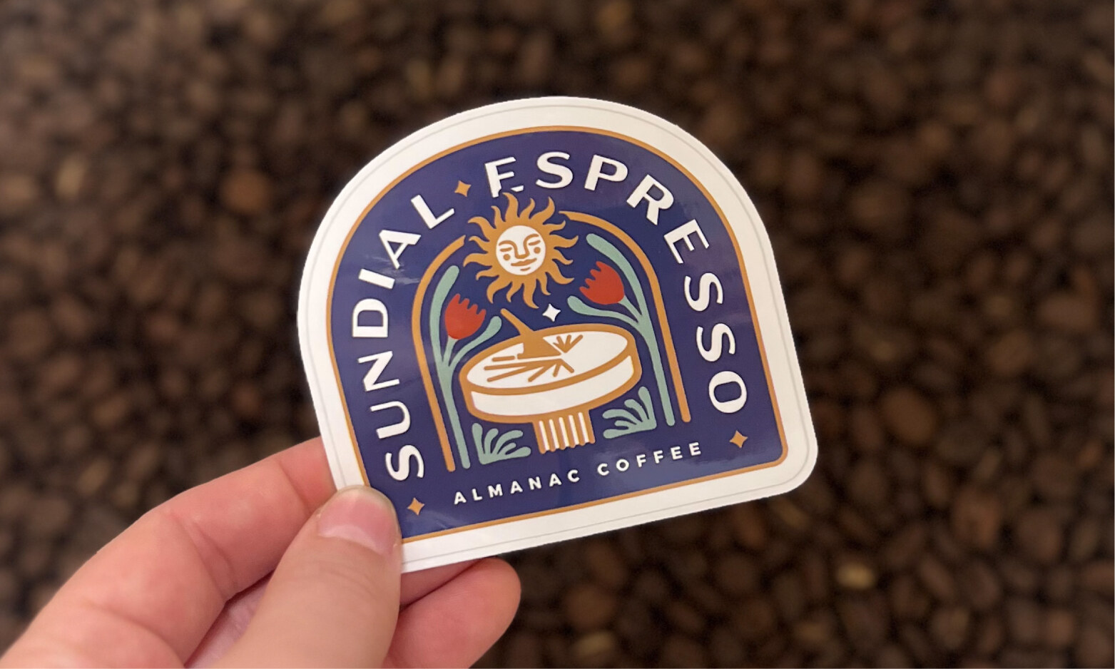
From there, I began sketching. I ultimately landed on a vintage emblem style with folk art influence: symmetrical composition, bold outlines, and a warm, limited color palette, centered on a hand-drawn sun-in-splendour face rising over a sundial.
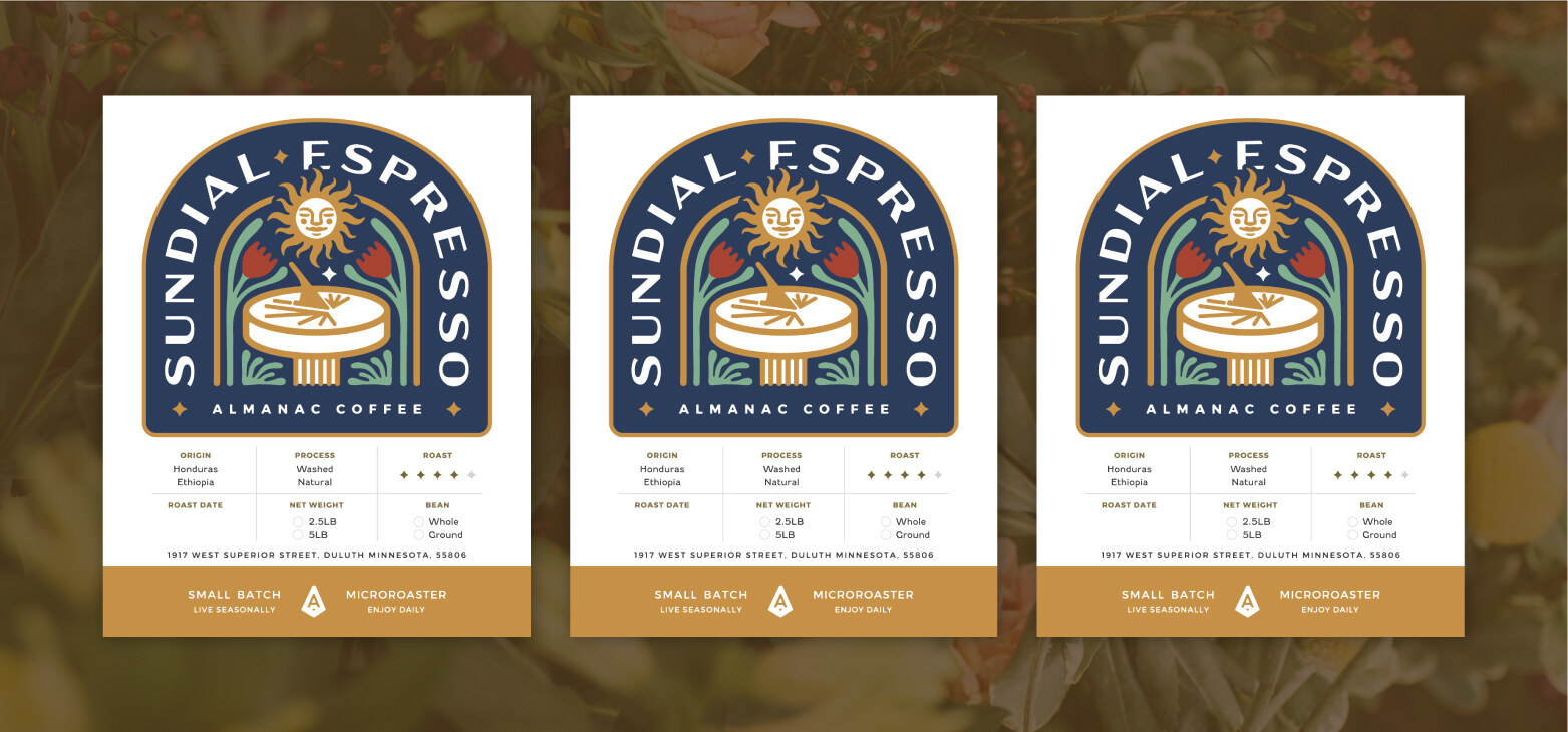
I used the same layout for bean and roast information as his existing line, keeping the new product consistent with the rest of his packaging. For the motto, we chose dum tempus habemus operemur bonum, "while we have time, let us do good."
The Outcome
Sundial Espresso launched with a full suite of materials: can labels, bulk bag labels, and cards for the bulk bins and display at Dovetail Coffee, where Justin's roastery is located. The rollout also included mockups and photography for web and social media, along with stickers.
The emblem layout and font system went on to serve a second product, a label for Justin's Bird Friendly Coffee, a Smithsonian-certified coffee grown to protect habitat for migratory birds, proving out the reusable system the project set out to build.